Dashboard
After logon the app presents you with the dashboard first. The left side contains the panel that navigates you to other work areas.
Clicking on ![]() gets you always back to the dashboard.
gets you always back to the dashboard.
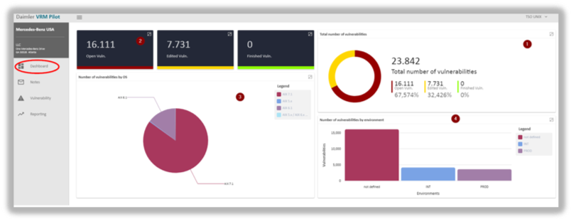
The right-hand panel consists of four graphs:
Graph 1 shows the number of vulnerabilities in absolute and percentage terms split into three assessment states: open, edited and finished.
- Open: comprises all vulnerabilities that are either new or have not been processed yet.
- Edited: comprises all vulnerabilities that are currently being processed and not completed yet.
- Finished: comprises all vulnerabilities for which the processing step has been completed.
Graph 2 repeats the absolute quantities of all vulnerabilities divided by their respective state.
 Please note: the number of vulnerabilities shown here is restricted. The panel displays only vulnerabilities that specifically belong to the individual TSO’s area of responsibility. They do not represent the amount of vulnerabilities of the entire company.
Graph 3 slices vulnerabilities into affected operating systems and represents them in a pie chart.
Conversely, graph 4 splits the number of vulnerabilities by system environment using a bar chart.
updated on: 5/9/2019 ⏐updated by: Wolfgang Stoettner ⏐ v1.0.1